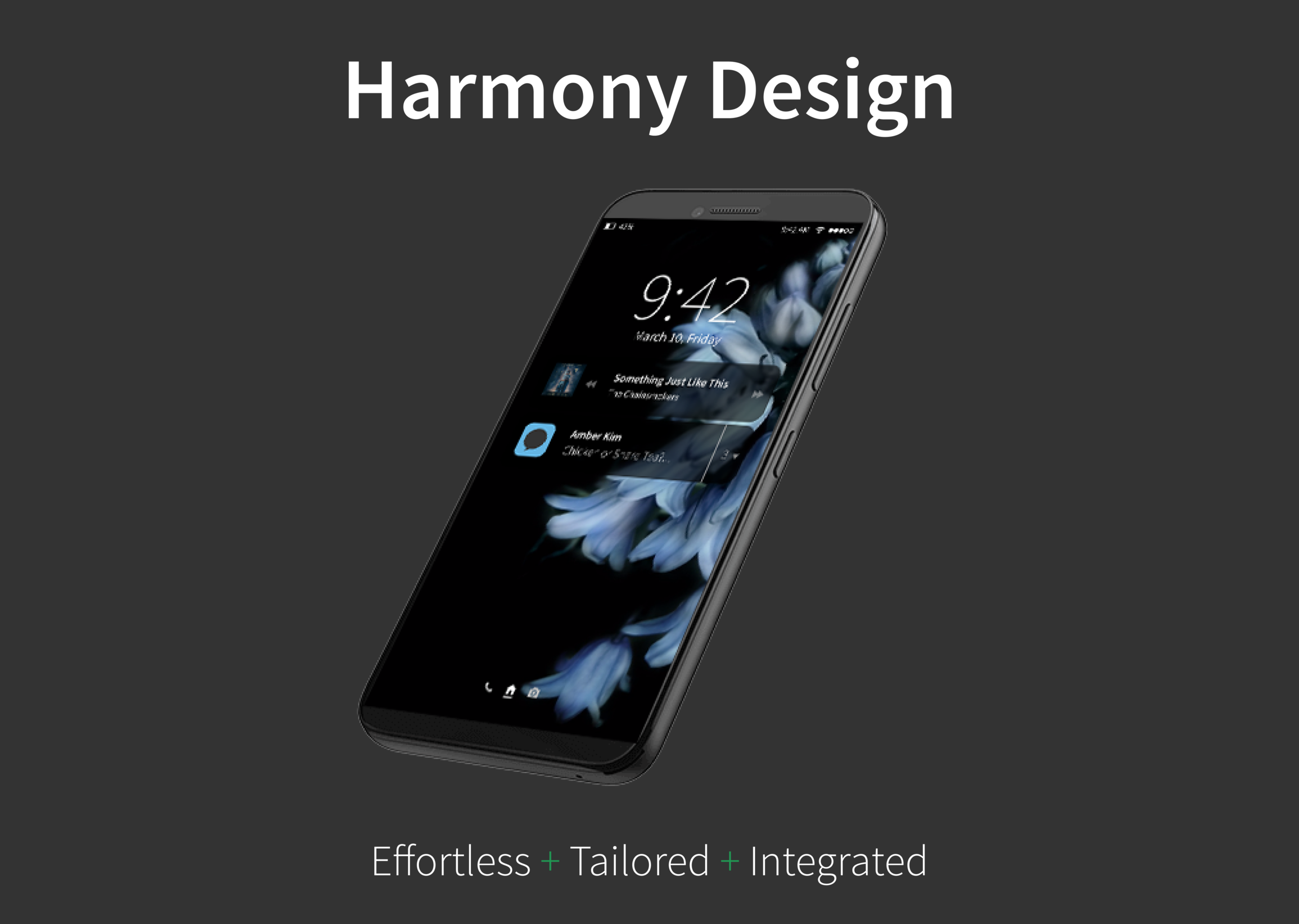
Harmony Design
Winter, 10 weeks
Background
“How might we create a new mobile OS that resolves existing pain points? How might we reduce friction for our users?”
In 2007, Apple released the first iPhone, which kicked off a new era of smartphones and smart technology. More than 10 years later, at least 35% of the world's population owns a smartphone.
In spite of improvements in technology, smartphones aren't perfect. Users commonly complain about slow load times, confusing navigation, information overload, and lack of consistent integration between the apps.
How might we reduce friction for our users?
Brainstorming session for our Problem & Vision Statement.
Competitive Analysis
To kickstart our project, we had to understand the competition first. We wanted to see what was working and what was not working for our intended users.
So, we studied Google's Material Design, micro-interactions, and user interfaces for gestures; played with existing productivity and utility apps; and evaluated users' reviews on Apple App Store and Google Play Store.
And, we discovered that users expected Privacy, Community, Instant Gratification, and Freedom for Self-Expression. Current interaction models confuse users. Users want faster access to the apps. They want freedom to choose from more options with less intrusive advertising.
These research findings informed the design of our mobile operating system, christened as Harmony Design. Harmony was born in Mobile App Design to a design team of 6 people over 10 weeks.
Defining the Look and the Feel
“Tailored.
Integrated.
Effortless.”
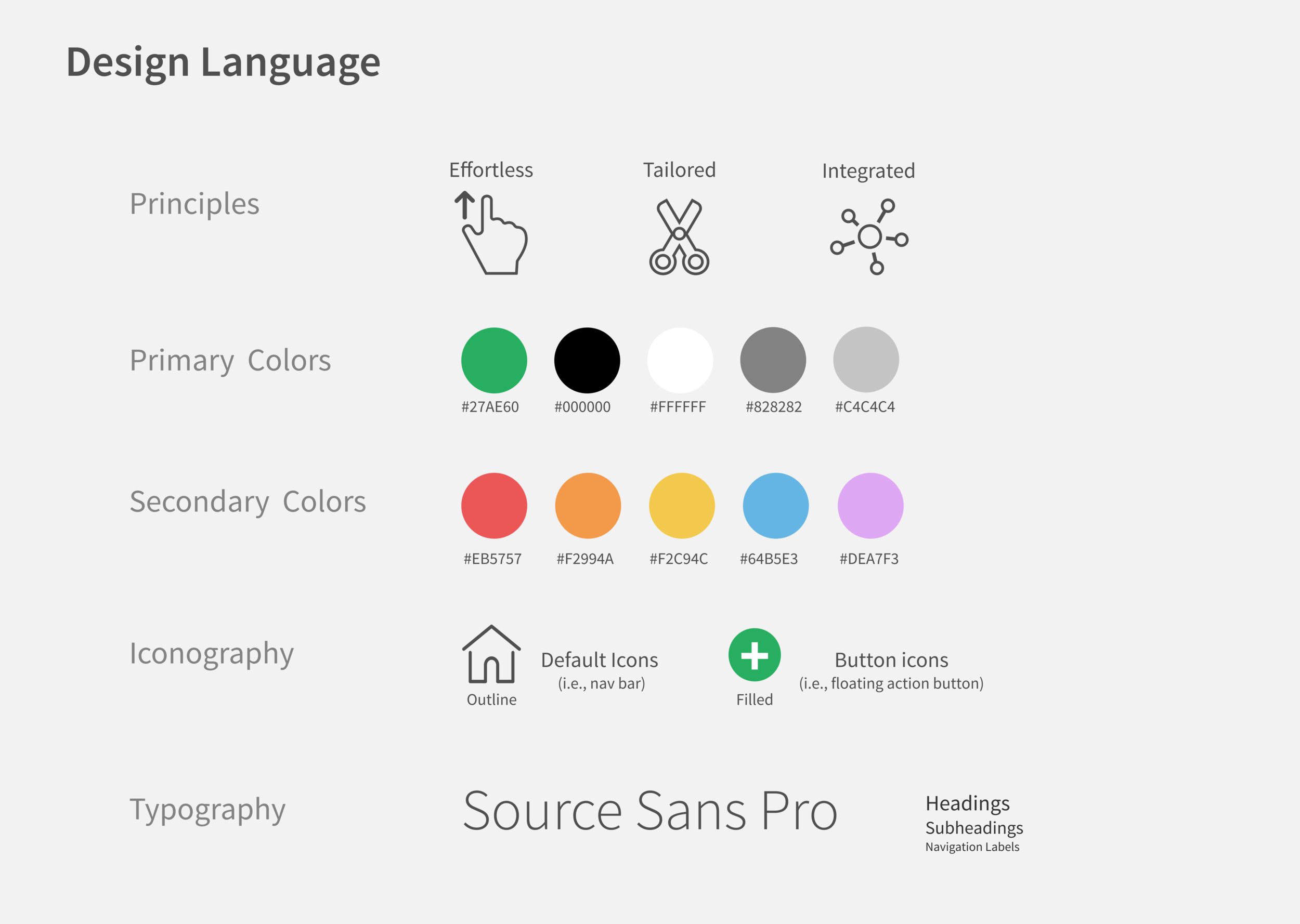
Design Language
We zoomed into our experiences with smartphones to construct our design language.
We curated our experiences into a list of vision statements such as “effortless,” “painless,” “seamless interaction,” and “inter-reactive,” meaning that the device responds differently to an unique set of interactions.
Eventually, we decided on three concepts: Tailored, Integrated, and Effortless. We arrived at these concepts by the process of elimination and brainstorming.
Tailored: The mobile OS should feel personal to our user.
Integrated: Interactions should be consistent across all screens.
Effortless: Work should be reduced for our user.
UI Style Guide
I illustrated the design principles of Tailored, Integrated, and Effortless in UI Style Guide:
Battle analysis paralysis with limited color schemes.
We chose monochromatic shades of grey, green, and red for system feedback (e.g., notifications).
We added secondary colors of pastel blue, yellow, red, and purple to denote personality and differentiate categories in native apps (e.g., Calendar, Photos, Notes).Improve readability and legibility with Source Sans Pro and recognizable icons.
The sans serif typeface makes native apps readable and legible on mobile devices.
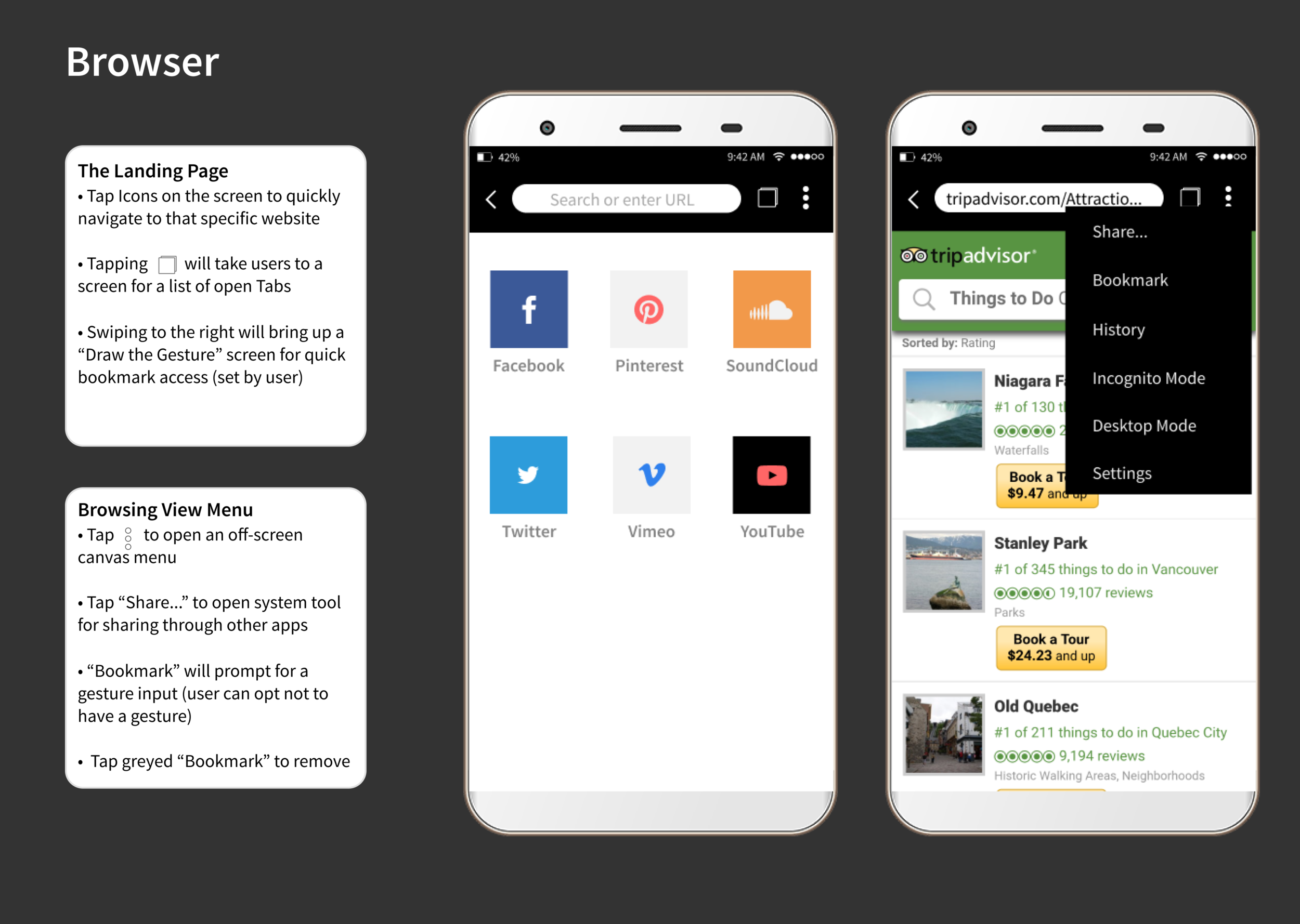
We standardized our round, compact iconography from Evil & Streamline kits.
Team members worked on the UI and interaction models:
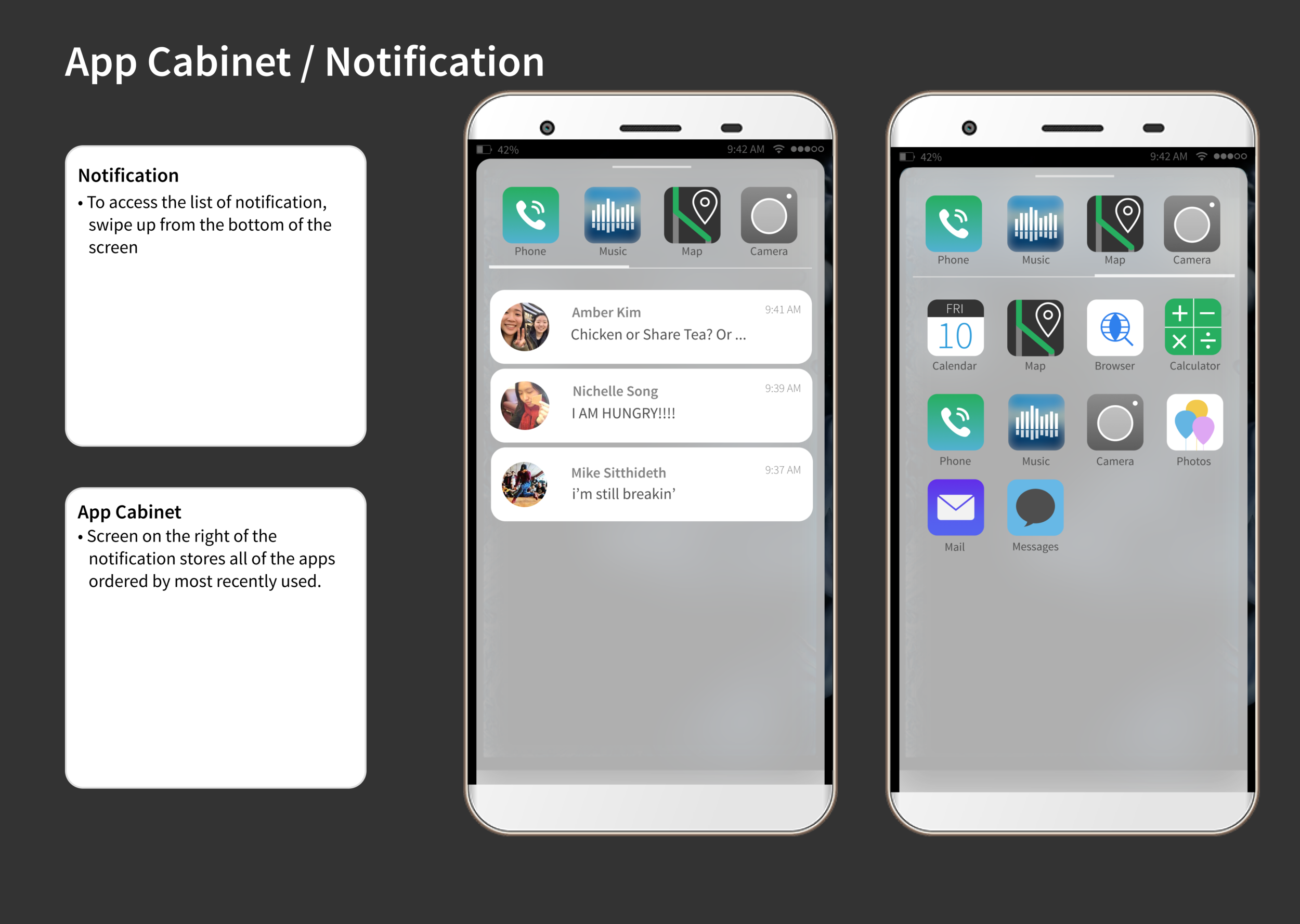
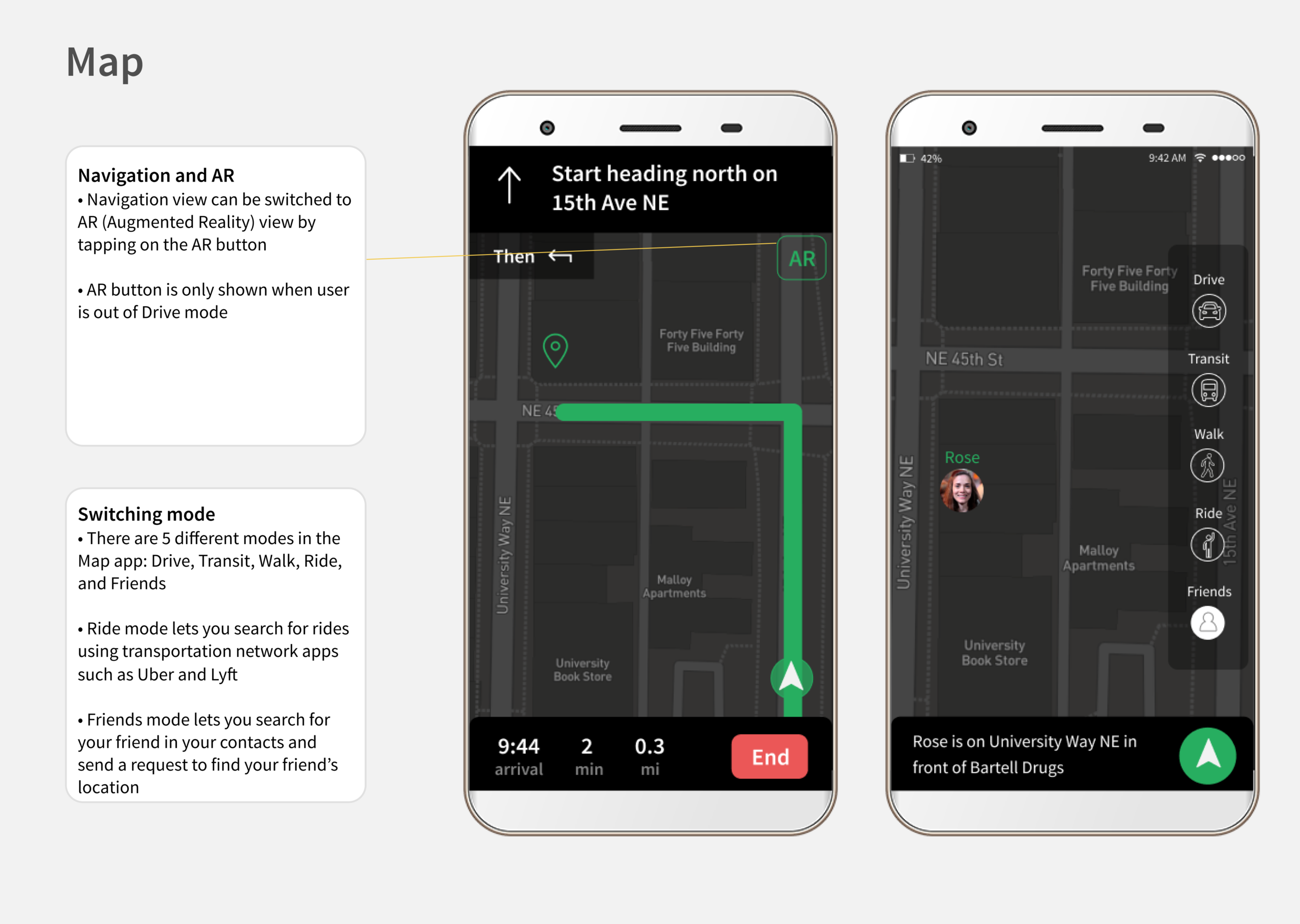
Cabinet: A list of all or most frequently used apps.
Pocket: A list of all or most recent notifications.
Loft: A toolkit of utilities for immediate use (e.g., flashlight, screen brightness, WiFi).
Creating the Apps as Part of the Ecosystem
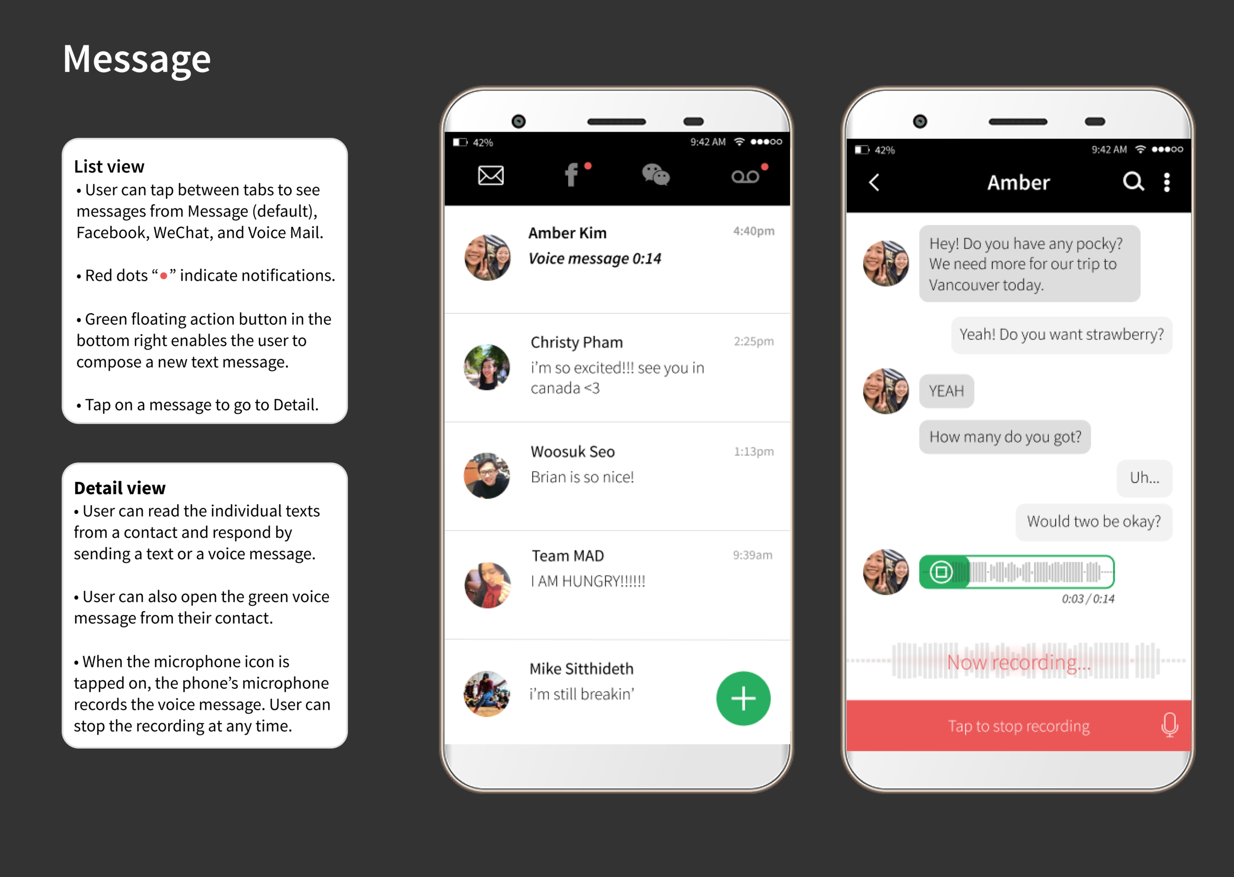
Messages
Screens for Messages should look simple and feel effortless. For example, I used bright red dots for notifications and segmented tabs for Read, Unread, and Voice Mail in the navigation bar (“nav bar”). Feeling proud of my initial work, I asked the professor for to critique the screens. The professor commented that I should not prioritize segmented tabs due to contrasting contextual cues. Segmentation should be used for two tabs, not three.
I took his advice to heart — I bolded and italicized Unread messages, and set Read messages to default. I added a Voice Mail tab in the nav bar for voice messages sent as text messages.
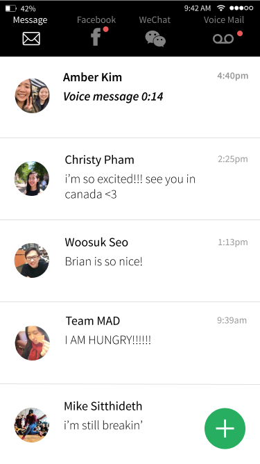
List view. Default screen for the Messages app.
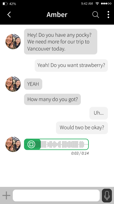
Detail view. To access the text conversation, tap a message in the List view. This conversation in the Detail view includes a voice recording.
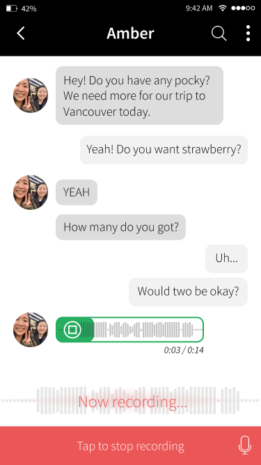
Detail view. To record your voice message, tap on the microphone icon in the bottom right. To cancel, tap the red area.
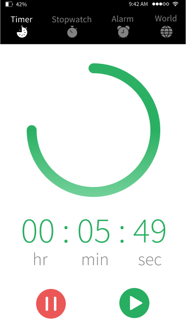
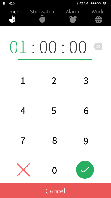
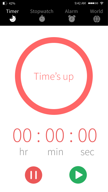
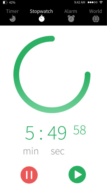
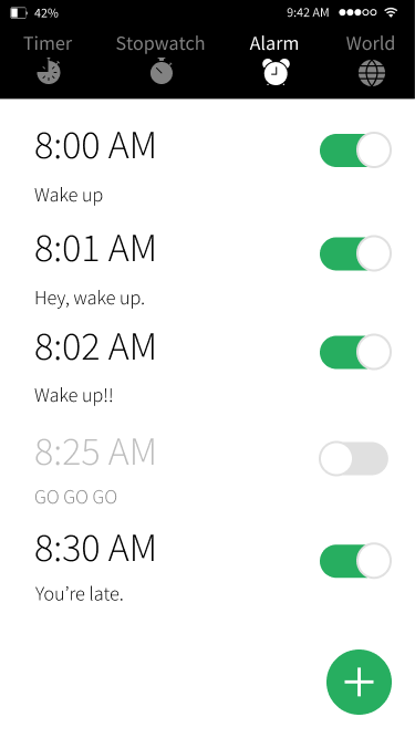
Clock
For Clock, I wanted to let my imagination run wild! I looked up UI designs on Pinterest for inspiration and sketched iterations for Timer, Stopwatch, Alarm, and World. Users should interact with Clock as with a physical clock through the process known as skeuomorphism.
Remember, we wanted our app to feel Effortless.
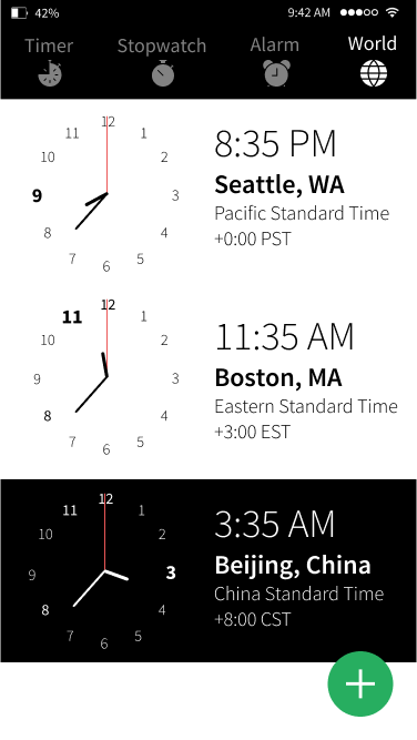
World – List view. To add or remove a time zone, tap the green floating action button.
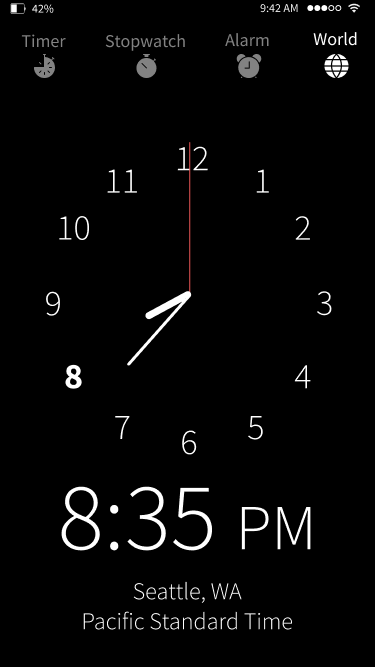
Analog view. Default screen for Clock.
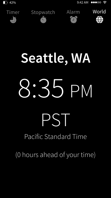
Digital view. To see the digital clock, tap on the Analog view once.
I also sketched Sleep Cycle inspired by sleepyti.me, a web app that calculates the user's ideal bedtime. However, my team informed me that Sleep Cycle crowded the nav bar that already contained four features — Timer, Stopwatch, Alarm, and World — so it had to go. I removed Sleep Cycle.
It was hard to let go of a design I'd been working on for a while. But it was the right decision for a minimally viable product.
Realizing the Result
After 10 weeks of design sprints, class critiques, and countless hours of late night snacks, we finalized our app suite. We presented it to industry professionals, praying for their approval.

How did we do?
A panel of local UX professionals judged our final product, rating each app in our app suite on a scale from 0 to 5. The final rating was an average of 3.75 out of 5.
An anonymous judge commented:
“Harmony has an Android feel. Most of the OS makes sense.
I didn’t like the pinch function in the calendar to set a new event, requires two hands. Much easier to hit a + icon. I like the idea of reordering app icons on a select screen based on their use.
With the camera, if you’re going to have the view area/dimensions larger than the photo ensure there are lines or something to let the user know what part of the view will be in the photo. Also, not sure about the instant swipe left or right to keep or trash a photo. Easier to quickly browse photos later and just tag and delete a bunch at a time.”
We appreciated their feedback for our interaction models. Not bad for our first attempt at designing an OS!
Reflection
// Beware the danger of too many cooks in the kitchen.
It was my first time working with more than three people in a team — the largest I've had. It was a constant challenge to make and justify design decisions because there were "too many cooks in the kitchen." In the future, an experienced designer or project manager could facilitate conversations on design and create consensus.
// Consider the big picture, then break it down.
I tend to consider the big picture, not the details. I listened to my team debate the merits and vices of micro-interactions. I justified my design decisions on the smallest UI elements. I learned to appreciate the finer aspects of interaction design.
// Seek critique early and often!
We consulted our professor for critique once or twice a week. In retrospect, we could've asked more people specific questions earlier and often because time is valuable. It is important to seek critique even if we feel embarrassed or uncertain. Ultimately, our design decisions affect everyone.
As a side note for future students...
Mobile App Design was wonderful — Brian provided invaluable instruction by letting us run wild and free — and I highly recommend it to advanced undergraduates seeking to improve their design skills. I'd strongly recommend having an arsenal of Pocky to power through evening sessions.