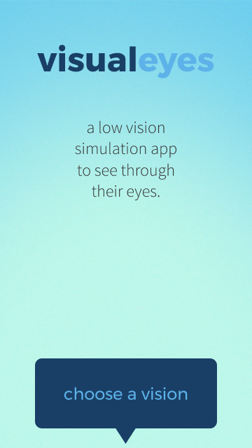
VisualEyes
Winter / Spring, 20 weeks
Length: 20 weeks / 5 months
Class: Informatics Capstone (Nam-ho Park)
Team PJJJ:
Project Manager: Parker
Designer/Developer: Jingwen "Chelsea"
Android Developer: Jordan
UX/UI Designer: Jessie Z.
Note on language.
We acknowledge that visual impairment can be interpreted as offensive. Some people prefer to identify as low vision. Others prefer visually impaired.
In Deaf community, hearing impairment is considered offensive due to the long history of colonization and eugenics. Impairment implies that the individual is “broken.” The Deaf community prefers d/Deaf or hard of hearing.
Due to the lack of shared history, community, and cultural identity, the term visually impaired does not carry as much stigma as hearing impaired does. However, language is always evolving so visual impairment may be outdated in the future.
Background
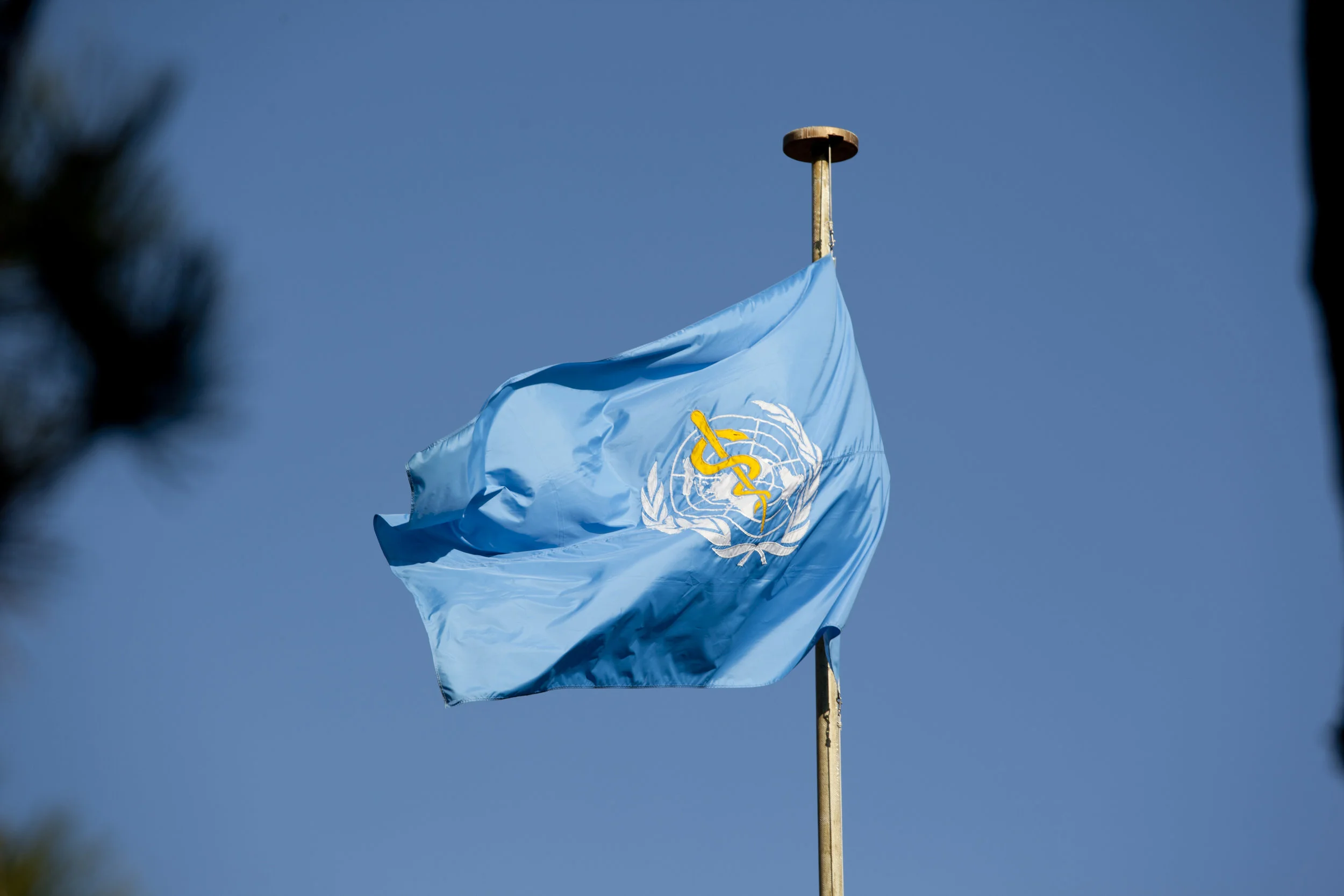
"More than 245 million people have some form of visual impairment." — World Health Organization (WHO)
In his project proposal to the team, Parker told us a story about his mother.
Ms. Duvall
Mrs. Duvall is one of these 245 million people. Due to cancer, she has multiple visual impairments: macular edema, central retinal vein occlusions, and depth perception issues. Growing up, her sighted son Parker struggled to understand her life as a visually impaired mother.
Many sighted individuals do not understand the lives of visually impaired individuals and the challenges they face everyday either.
Thus, our question became:
How can we encourage sighted individuals to learn to appreciate and empathize with people with visual impairments?
Brainstorming & Validating the Idea
To answer the question, I chose low vision simulation because we believed that if people could see the world through the eyes of those with visual impairment, then they could better understand how mundane tasks could be challenging.
We could build an Android app, tentatively DynaSee, to simulate low vision. It would include multiple filters of different visual experiences with Google Cardboard integration for VR.
Since our app dealt with a vulnerable population, we approached our project with care.
It wasn’t easy and we learned a lot.
User Persona + Storyboard
To imagine situations where people would use DynaSee, we created user personas and storyboards. I envisioned Aaron, an optometrist, using the app to show patients and their loved ones what their vision could look like in the future.
Persona Name: Aaron
Age: 35 years old
Occupation: Optometrist
Key Audience Group: Industry professional (Optometrist)
Goals & Motivations: Tracks data for patient. Helps the patient’s family member better understand their situation. Ensures that the patient’s vision is stable; if it worsens, recommends treatments. Prescribes glasses and eye contact lenses. Aaron wants to help people maintain good vision. He wants more people to understand what it's like to be visually impaired.
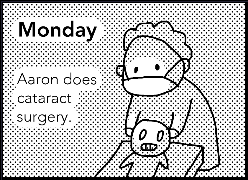
Monday: Aaron does cataract surgery.
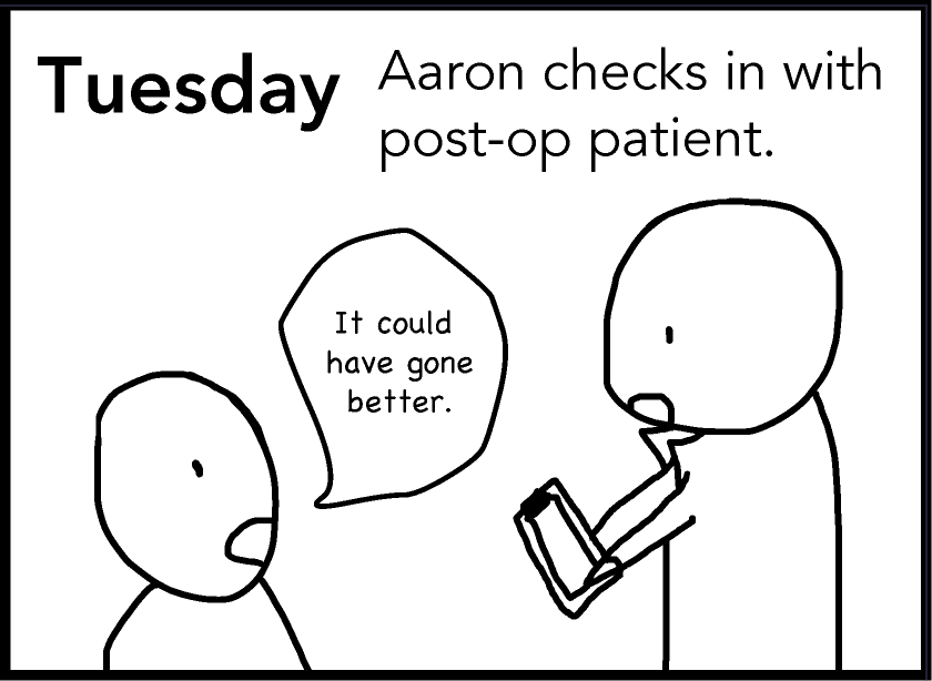
Tuesday: Aaron checks in with post-op patient. Patient: “It could have gone better.”
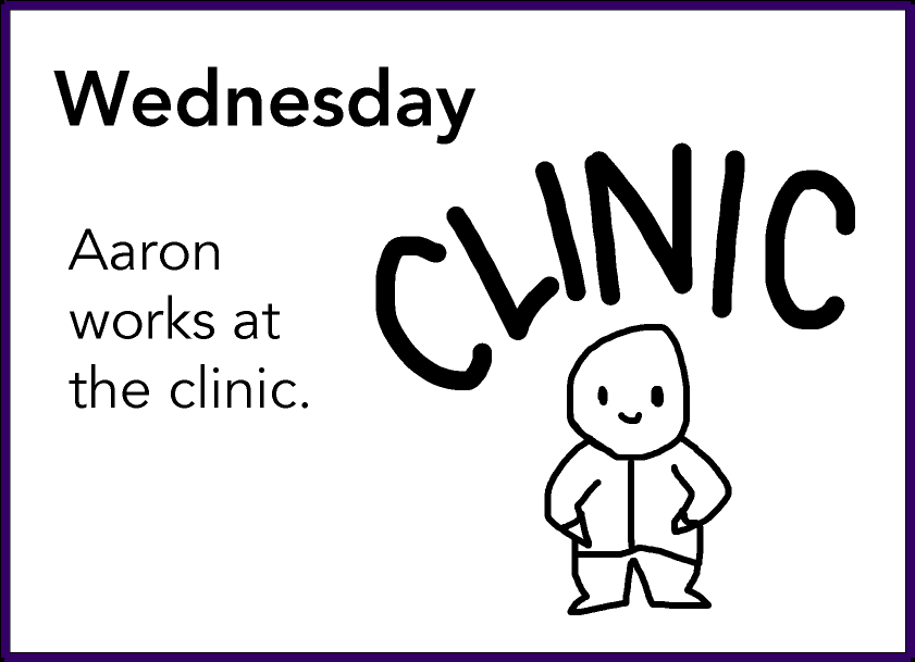
Wednesday: Aaron works at the clinic.
Literature Review
We consulted Kristen Shinohara, a PhD candidate specializing in accessibility. She recommended reading Stumbling in Their Shoes and The Perils of Playing Blind: Problems with Blindness Simulation, and a Better Way to Teach About Blindness Section, and connected us with a colorblind researcher by email.
Our literature review revealed that simulating visual impairment was feasible but could inadvertently promote discrimination, not empathy.
We didn't want our app to promote discrimination, so we consulted Prof. Nam-Ho Park. He recommended audiovisual storytelling to promote empathy because storytelling is powerful for inspiring social change and calls to action.
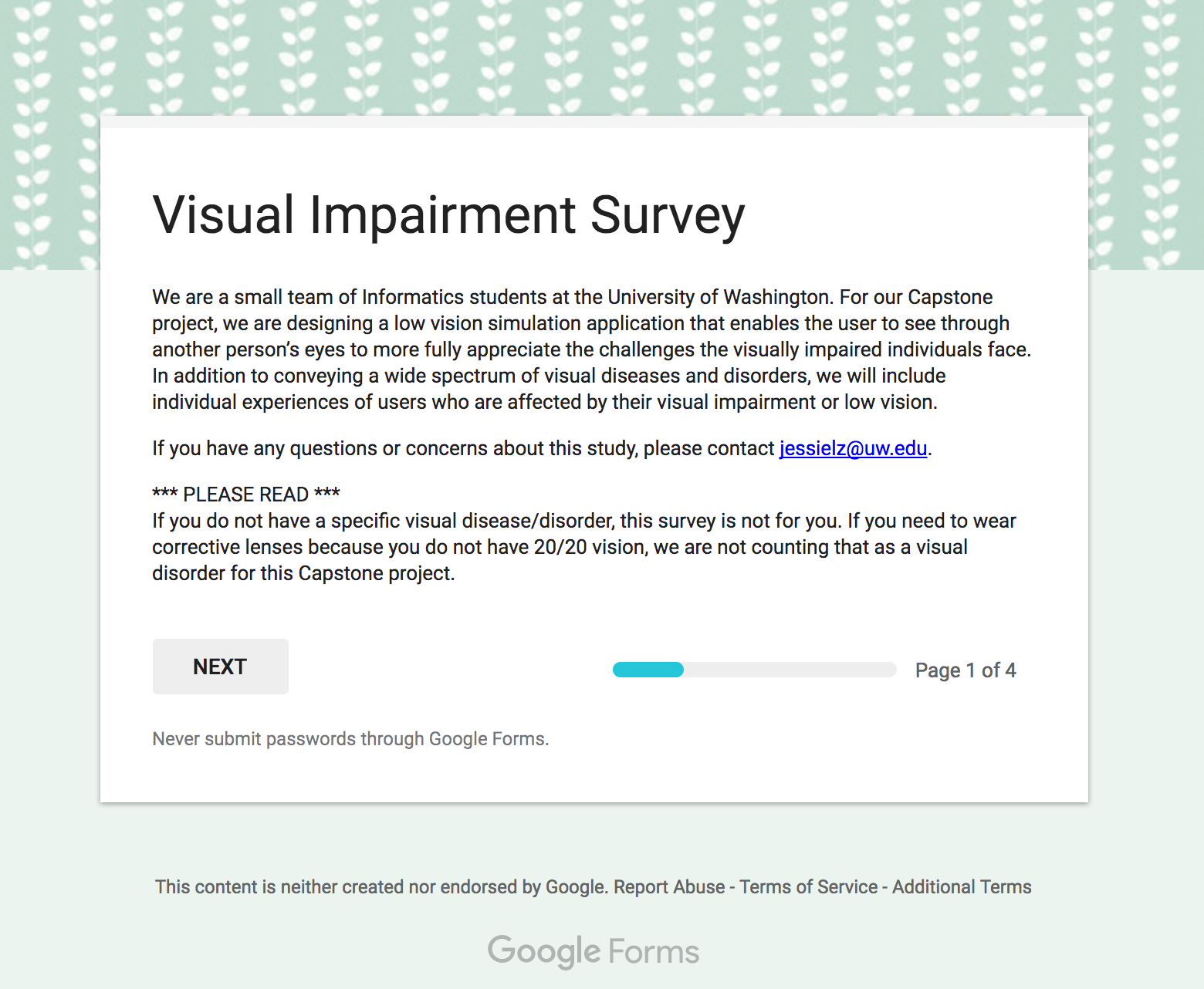
Survey + Results
We still needed data to validate our idea, so we distributed a Google Forms survey via social media and emails to disability organizations like DO-IT. People with visual impairments shared anecdotes.
A colorblind undergraduate student shared:
"I hope someday that all maps/graphs published on the web will give you the choice to change the color scheme to a different set. For example, I have trouble reading any maps or graphs from Nat Geo because almost everything follows a red-green spectrum; if they had additional preset color spectrums you could switch to, that would be super helpful. Kinda like how some games these days (ex. Destiny) give you options in the settings to set the HUD/user interface to different color presets based on what type of colorblindness you have."
Their responses validated our idea of a low vision simulation app that uses audiovisual storytelling to encourage empathy.
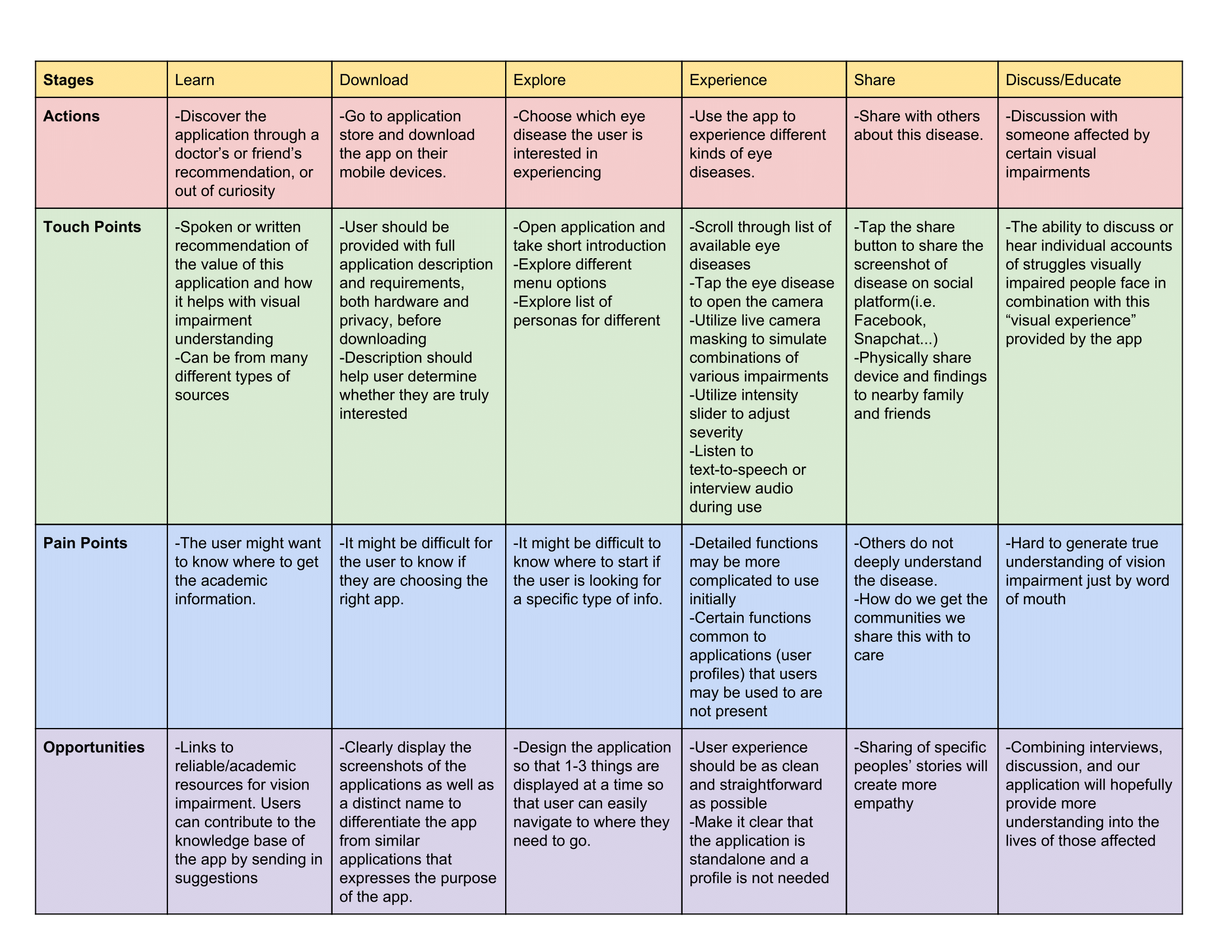
User Journey
Now that survey results and literature review validated our ideas, we started designing, starting with the user journey. To prevent discrimination, we framed our app as an augmentation of sighted users' knowledge of visual impairments.
The user can discover and download the app, explore different features, experience low vision filters, share screenshots with people, and discuss and educate on specific visual impairments.
We identified our key functionalities:
Multiple filters: Select multiple visual impairments.
Intensity slider: Increase or decrease the intensity of a visual impairment.
Share to social media: Share the image to Facebook, Twitter, or Tumblr.
Photo Library: Save the image to the phone's photos.
Find information: Learn more about the visual impairment.
Design Language
We needed to develop a cohesive look for our mobile app. The app should be accessible, inclusive, comfortable, and easy to use and look professional and trustworthy. We renamed our app VisualEyes – a wordplay on "visualize" and "visual eye."
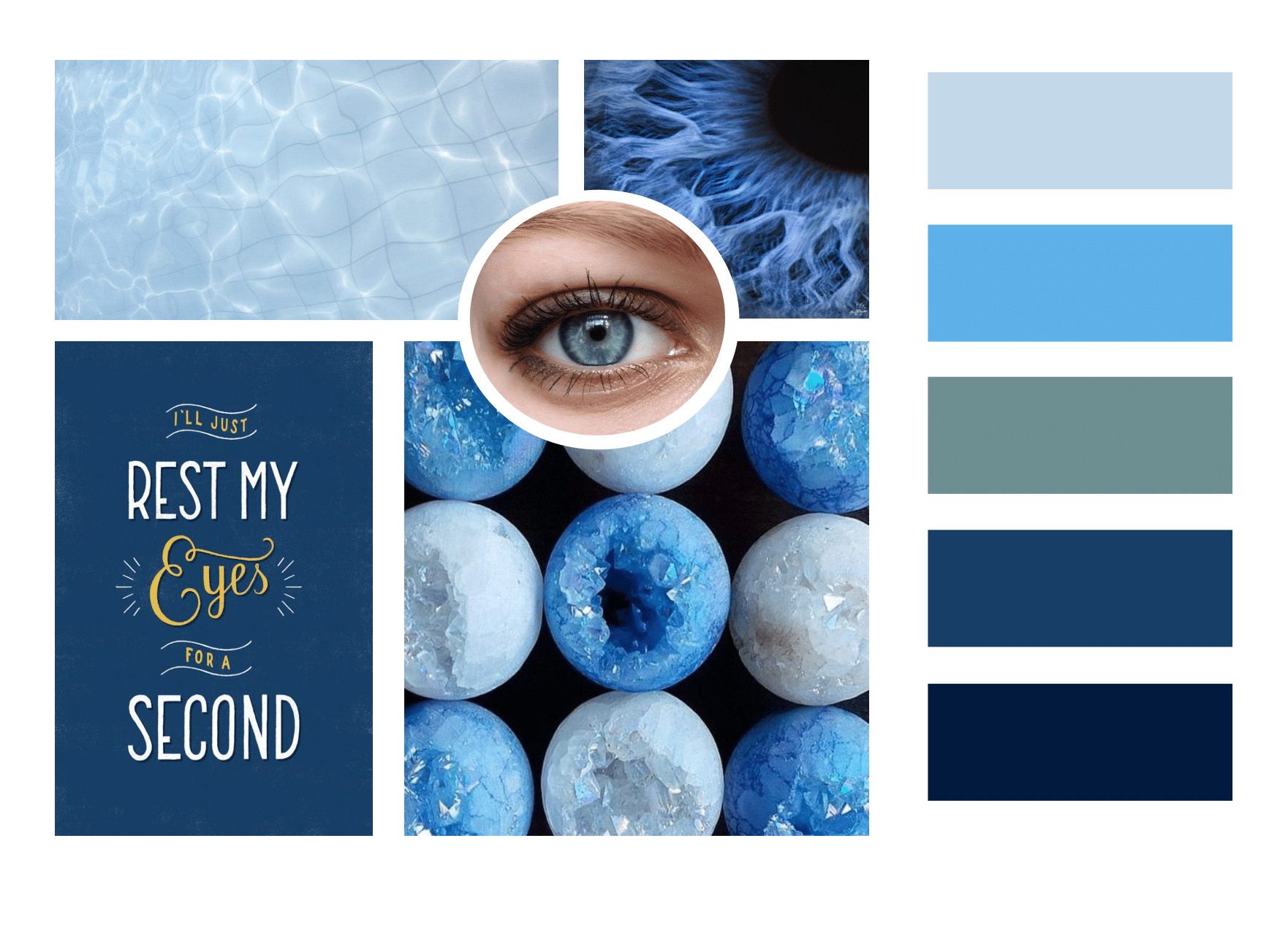
Mood board displays images of swimming pool water; blue iris (eye); blue poster saying “I’ll just rest my eyes for a second” in yellow and white type; light and sky blue crystal balls; and five color blocks: light blue, blue, teal, navy blue, and indigo blue.
Mood Board
Jingwen created three mood boards. We chose the final mood board with sharp, vivid blue colors for simple contrast and large visibility. Blue is an uncommon eye color and the most distinguishable color for the colorblind.
For headings and labels, we picked Montserrat for simplicity and clear legibility in sans serif. For body text, we chose Open Source Pro for easy readability when the text is dense.
Design Mockups
Jingwen and I based our UI designs on the mood board and technical specifications of Android. Due to time, we couldn't include my UI designs below in the final poster and functional prototype.
Loading screen. Default for VisualEyes.
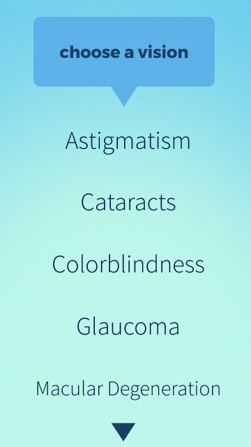
Selection view. The user can choose their first visual impairment.
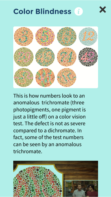
Information view. The user can learn more about a visual impairment.

Main view. The user can see the original image and make choices.
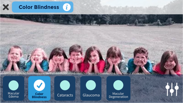
Filter view. The user can select from more than one visual impairment to create a filter.
Designing the Poster
First Iteration: Rough
Judges used the poster to determine winners of awards such as Best in Class, Social Impact, Diversity, and Service. We presented at the Informatics Capstone Night, which attracted hundreds of attendees from the technology industry to family and friends.
Due to a tight poster submission deadline, I made the poster in Adobe Illustrator in a few hours with a simple layout. Though our instructors commended us on the layout, we felt it lacked the visual punch. The oomph, if you will. In response, they suggested larger images to draw in the audience from a distance.
We wanted to attract attention.
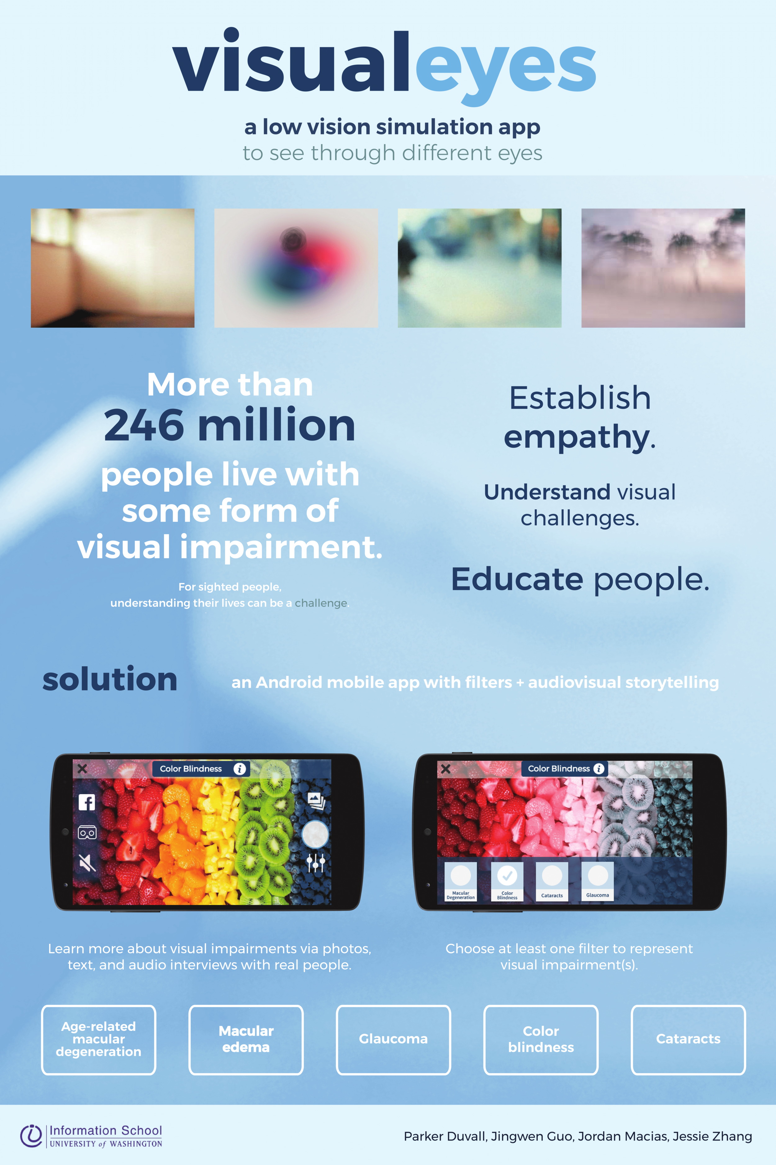
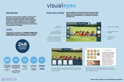
Final poster. Text: VisualEyes: a low vision simulation app to see through different eyes. More than 246 million people live with some form of visual impairment. For sighted people, understanding their lives can be a challenge. Establish empathy. Understand visual challenges. Educate people. Solution: an Android mobile app with filters and audiovisual storytelling. Learn more about visual impairments via photos, text, and audio interviews with real people. Choose at least one filter to represent visual impairment(s). Age-related macular degeneration. Macular edema. Glaucoma. Color blindness. Cataracts.
Second Iteration: Clean
Jingwen provided images and a vertical layout for our final poster. We prioritized visuals to convey the social impact of our project.
A Visual Communication Design student suggested taking a blurry photograph of a large space with minimal white noise. Armed with a Nikon DSLR camera, I photographed the Allen Research Commons stairs and processed the RAW image in Adobe Photoshop with a light blue filter.
RAW image of
Allen Research Commons
The poster mirrored the look of VisualEyes with the typeface Montserrat and blue hues. While the layout mixed 2 columns and 1 column, the poster successfully captured audience's attention at Capstone Night.
Presenting the Project
After five months of working on VisualEyes, we presented our project — poster, video, functional prototype — to more than 200 people at the iSchool Capstone 2017 on May 31, 2017.
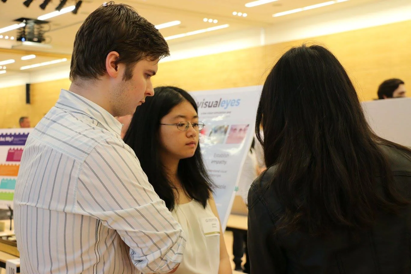
Parker and I discuss the project with an attendee at Capstone Night.
Reflection
duck face
(・⊝・)
Have your ducks in a row before committing.
We ran into numerous roadblocks that we should've predicted at the beginning:
Time management. We had to balance our schedule with demanding classes, which made Capstone difficult to realistically achieve in the short 5 months.
Lack of expertise. It was challenging to achieve the complexity of the project with our current skills, since our developers were new to Android development.
Scope creep. We constantly underestimated our project scope and had to narrow it significantly by the end.
anguished face
( ´△`)
Actually talk to visually impaired people!
Some of the visually impaired people we surveyed wanted to be more involved. Sadly, we lacked time and local connections to the low vision and visually impaired communities. We'll make sure to honor them next time!
saluting face
(・_・ヾ
Never ever ever underestimate project management.
The Capstone was a huge learning experience for everyone. Project managers must make sure that the project is on track to completion. In addition to design, I improved my team communication and collaboration. I asked questions to determine whether to cover their weaknesses (e.g., timely contribution) as needed.
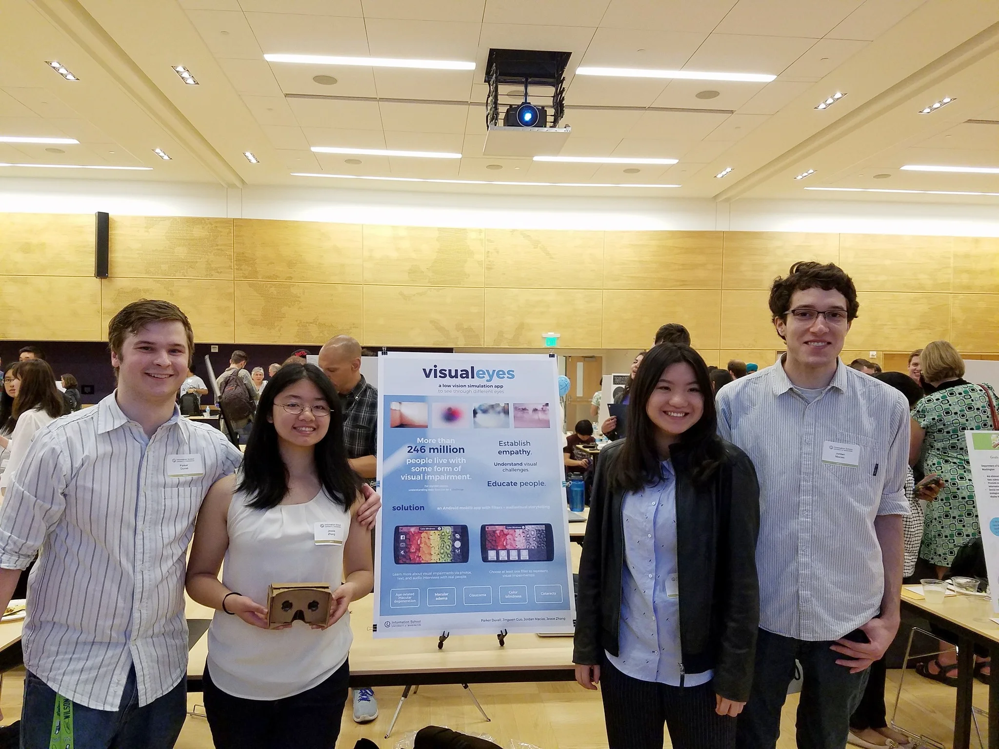
My team and I smile with our Google Cardboard and poster at Capstone Night. We are all wearing blue and white.