Choosing the Next President of the United States
Spring, 10 weeks
As the race gears up to replace President Barack Obama as the President of the United States, multiple candidates from all political parties are vying for this hotly heated office! Stakes have never been higher for everyone involved.This infographic aims to help first-time Washington State voters navigate the often confusing process of electing an eligible candidate as the President of the United States.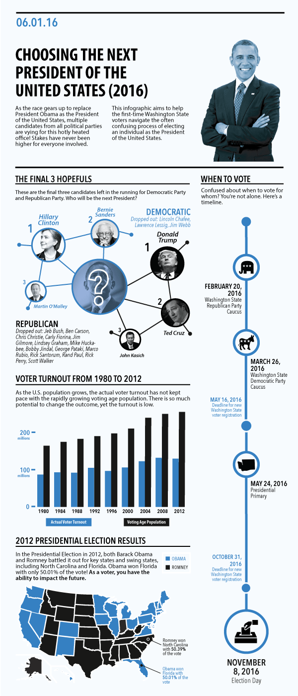
Final infographic for "Choosing the Next President of the United States (2016)".
Background
At the time of this project, it was 2016 — a pivotal year for so many reasons. As I reflected on the generational and racial/ethnic divide in voting patterns of US citizens, I noticed that many eligible voters were not educated or under-educated about the process to elect the President of the United States.
I reflected on my first time voting at age 19 as a painless experience. Reading news articles and hearing accounts from friends out of state, I started to grasp my privilege of voting in the Washington State, where I live; my privilege of mailing a ballot without showing a photo ID; and my privilege of receiving civic education starting as early as 5th grade so that I may be a participatory citizen. Shout out to Ms. Gottlieb!
I often wondered why my parents hardly voted when the media and education made it blatantly clear that voting is crucial to making key decisions that affect everyday Americans’ lives. Though this infographic doesn’t explicitly put out a call to action, my hope is that this infographic makes the political process more transparent and helps eligible voters make an informed decision.
“How might we educate eligible voters on the process of electing the next President of the United States?”From Idea to Execution
Presentation video of my final infographic. Apologies for the condensed text.
Reflection
Throughout this process, I learned more about manipulating data to draw conclusions and justify the call to action — in this case, the call to make an informed decision and vote for the future President. I'm pleased with the art direction, as my infographic clearly and concisely conveys vital voting information. The professor and TA ran out of things to critique!
That being said, here are some minor visual improvements that I can think of:
Add whitespace between the U.S. map and the text in "2012 Presidential Election Results".
Narrow the timeline under "When to Vote" by 1 pixel.
Darken the blue filter for President Obama's image to match the rest of the filters. Consistency is key to believability.
Add red to some images. Blue as the only color implies that I'm favoring Democrats over Republicans.
The infographic clarified my initial assumptions about the process of voting, an integral component of the U.S. constitutional republic. If I were to redo this infographic, I’d want to incorporate stronger language — logos and ethos — to persuade the qualified U.S. citizens to do their research and perform their civic duty of voting.